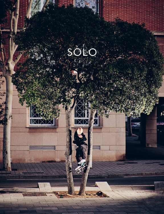
Just like everyone involved in Pass~port, Marcus Dixon is somebody you instantly want to have a beer with at the pub, cause he’s fun. You can see it in his artworks. They have soul cause he’s prefering fun ideas over perfect vector graphics when he’s illustrating a new board. He’s serious about what he does without being serious. His friend Izrayl Brinsdon followed him to his desk with a camera and for us Marcus talked about some of his favorite boardgraphics he’s done so far.
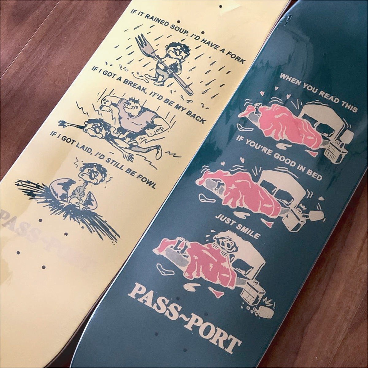
I find that when I am approcahing a graphic, I get way more caught up in the idea or how it could be clever or funny that when it comes time to execute it, I usually just go with the simplest approach. In this case, I saw the text “If it rained soup, I’d have a fork” and just thought the idea of that is so ludicrous in terms of a representation of an unlucky person I just had to continue the theme. Was quite happy with the “Laid-fowl” line.
The “good in bed” graphic was made funnier to me because someone said ”There’s only one person in the bed how can he be good in bed”. One track minded individual they must’ve been.
Don’t think these graphics really made much of a splash in the skate graphic world but they are probably my favourite.
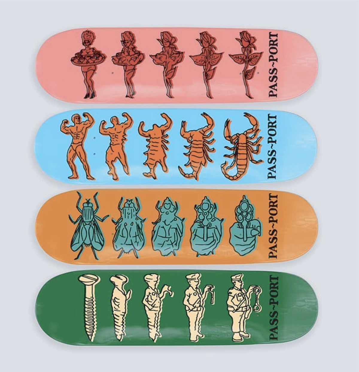
I got pretty into this morphing style of graphic for a while. It seems to be handy especially when they need some animations for a video or something, these are pretty much good to go when laid over top of one another.
I remember for these it was quite the task to think of two things that looked like they were in a similar position. I think that took much longer than the actual boards took to illustrate. I originally had them set out with a colour fade that went through the images but someone in office changed that to this bright simpler style which i like better.
For most graphics I use a cheap, simple artline pen but for some I use a brush and ink. I probably find it more enjoyable to do things this way. It is never going to be perfect and it’s nice to play with the pressure you put on the brush to create the differing line widths. Again, you can see this throughout a majority of my graphics, it is more about the idea on each board then the technical aspect of their execution.
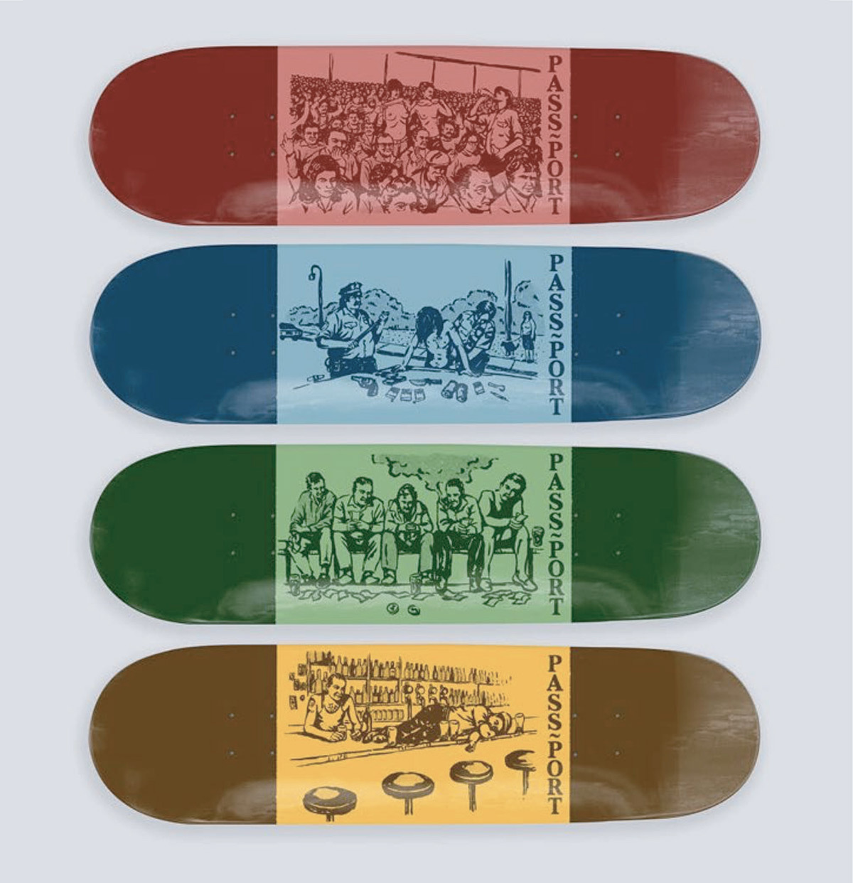
All the graphics I have done for Pass-Port are all hand drawn first then scanned in and certain things added in post. This was basically just a simple halftone pattern brush and colour change done in photoshop.

This graphic was part of a four board series but I found this one to be a stand out for me. It is really stupid. Always just makes me kinda laugh thinking about it. Gets quite a high score too – it’s pretty impressive.
I got heaps into doing boards that show a sequence of something happening. I have tried to sneak one in almost every range since I started doing graphics for PP. It has seemed to have become a bit of a running joke in the office. I think Trent (owner) said something like “you’re turning us into the sequence company” or something like that. You’ll thank me later, Trent.

Another of the sequence style boards that has become a bit of a “gimmick”. Maybe I just can’t think of single graphic boards anymore.
Generally I will use a lot of references in my work. Lots of old QSL cards, old mag ads etc etc. I occasionally will expand and appropriate an image or idea they have had. Especially in the case of sequence boards. I may see something and think “that’s good, but what is gonna happen after that frame”. Not in every case though. For example here I just get told I have an egg shaped head (kind of like Adam Sandler) so I expanded that as a sequence of a guy waking up in a birds nest.
If you look closely at any graphic I have done you can notice that nothing is perfect. There’s usually a bit of scanner fuzz, lines have bled out, colours don’t line up etc. It is just all part of a general aesthetic that Trent/Sam used for early PP stuff. Bold and beautiful. Perfect vector graphics freak me out. They just remind me of something you’d see at Kmart.